01
Rebuilding the brand system
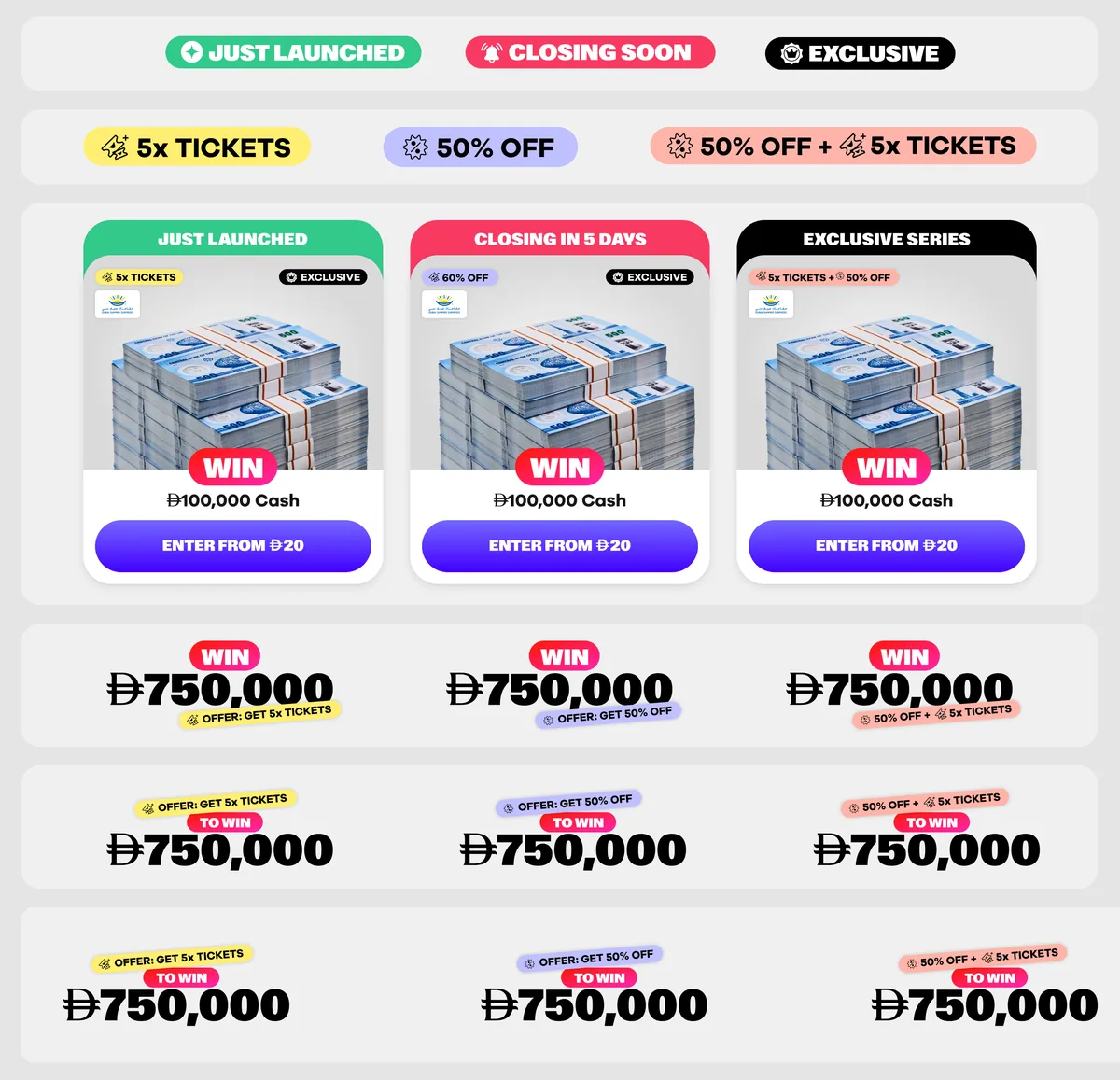
Replaced the old script “Win” with a bold WIN pill, then built a family of status and offer pills around it that work across every surface.


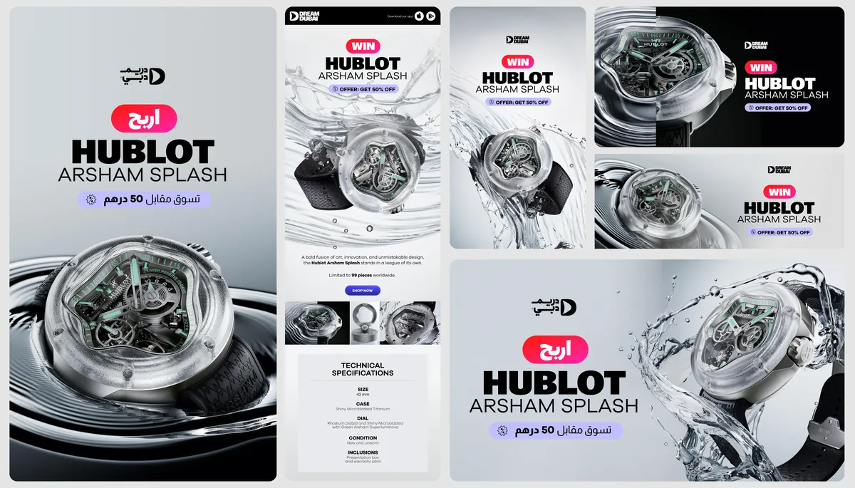
The old brand visuals changed type and treatment from one campaign to the next, so nothing felt like one brand. The WIN pill became the anchor: a single, recognisable mark that sits on product cards, prize lockups and ads alike. Around it, colour-coded pills flag status and offers, and they stack together so any draw can be read at a glance.